Metrics Explorer Page
Sentry Metrics is currently in Alpha, so be gentle - features are still in-progress and may have bugs. We recognize the irony. If you would like to join the Alpha program, you can register here.
Once you've started sending metrics to Sentry, you can explore them in the product using the Metrics page. It might take a few seconds for the first datapoints to appear.
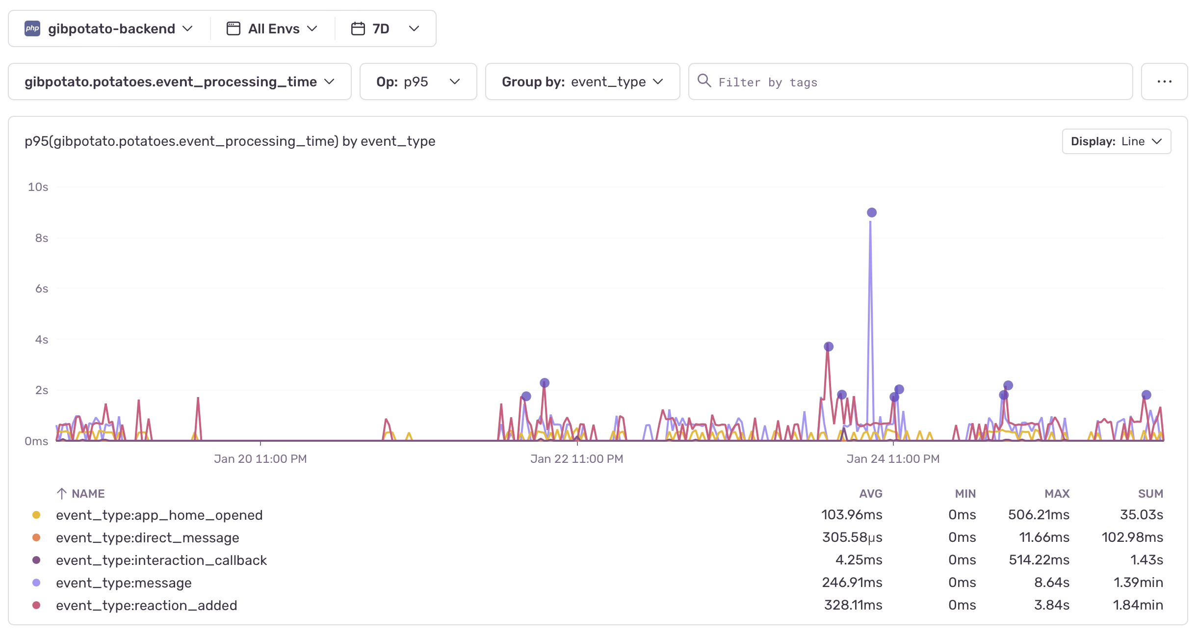
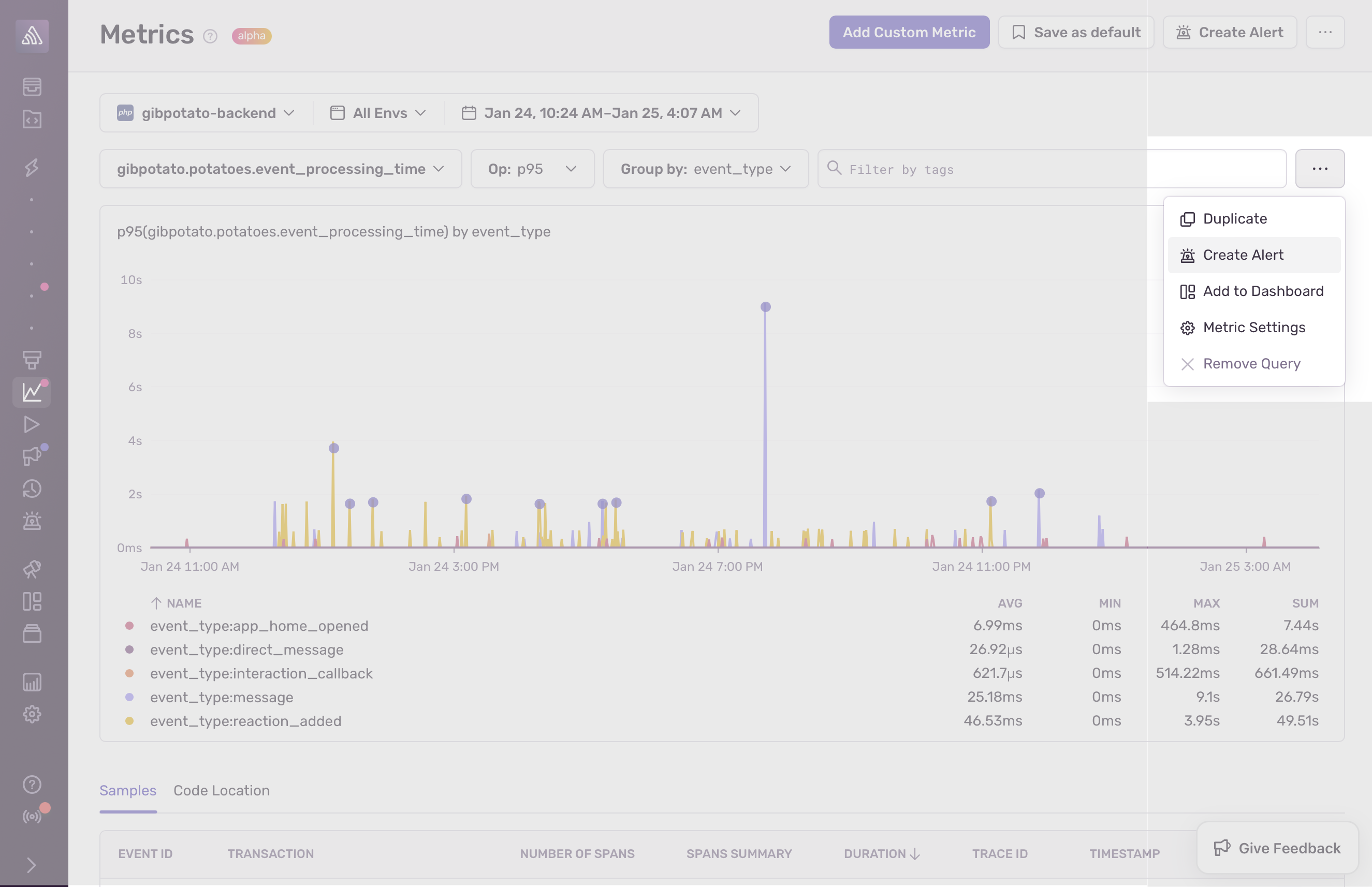
You can use the dropdowns at the top of the page as a query editor for your metrics. Select the metric you want to plot from a list of available metrics in your project, the aggregate operation you'd like to perform (for example avg, min, max, percentiles, and so on), and, optionally, any tags you'd like to group by. In the image above, the p95 values of the metric, gibpotato.potatoes.event_processing_time, is queried and shown, grouped by event_type.
Optionally, you can also use the search bar to filter for specific tag values. In addition to custom metrics that are defined by your team, you can also explore any performance metrics that Sentry offers out-of-the-box.
The results of your query will be displayed on a chart below. You can use the "Display" dropdown on the top right-hand corner of the chart to choose whether to visualize your metric as a line, area, or bar chart.
Underneath the chart, you have a summary table where you can see avg, min, max and sum for your metric at-a-glance. When using group by, you might have multiple time series displayed on the chart and multiple lines in your table that represent each segment.
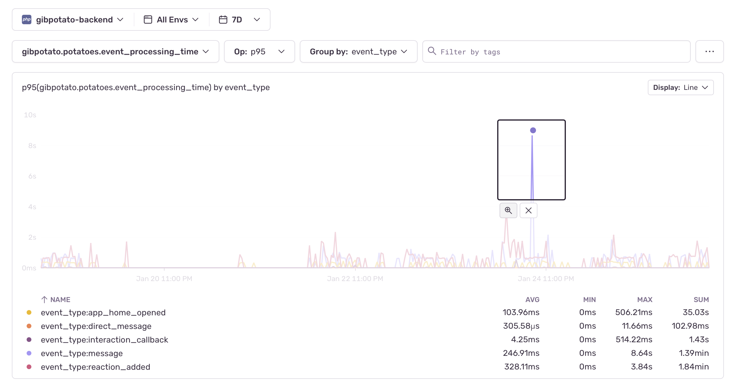
If you'd like to zoom in and dig deeper into a particular area of your chart, draw a rectangle over your area of interest. This will narrow down the visualization to the particular time and value range that you've selected.
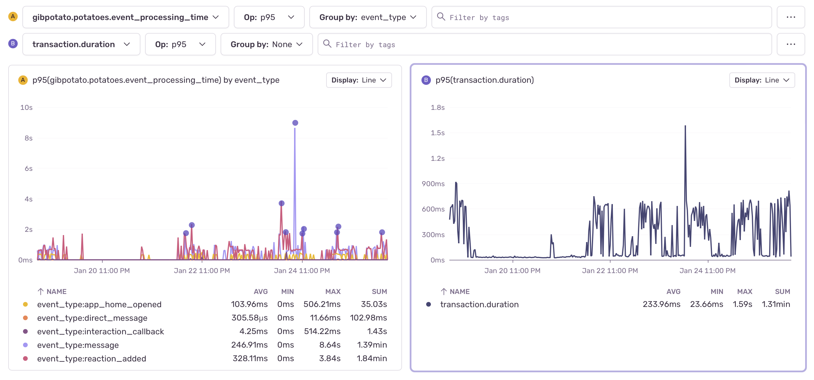
While observing one metric is sometimes enough to reach an insight, it's oftentimes necessary to look at multiple metrics simultaneously to find potential correlations. In this case, you can create additional queries in order to compare and contrast different metrics. Click "... > Add Query" in the top right-hand corner to create a new query. Alternatively, you can also click "... > Duplicate" next to an existing query to create a duplicate of that query.
Currently, this feature is only available in Python and PHP.
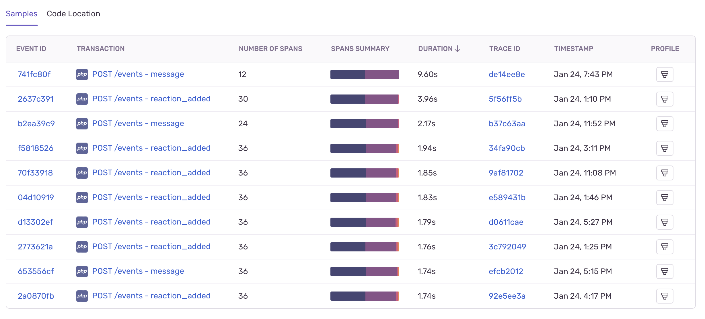
While metrics are a great tool for analyzing your data in aggregate and identifying possible issues, you often need to go deeper and look at the correlation with other signals, such as traces, to find the root cause for a particular anomaly. Below your metric charts, the "Samples" tab shows a list of sample transactions to help you with your investigation. Click on a transaction to see more details.
Currently, this feature is only available in Python and PHP.
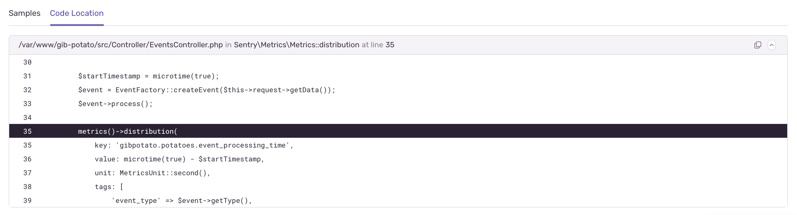
When it comes to custom metrics, you can use the code locations tab to see the line of code in your application where your metric is being emitted. This can come in handy when troubleshooting an issue, especially if you were not the one creating the metric in the first place.
In order to stay ahead of issues, you can also create metric-based alerts to get notified about unexpected changes or spikes. Click "... > Create Alert" next to your metric query to configure your custom metric alert.
If you want to continuously monitor a particular metric, click "... > Add to Dashboard" to create a new Dashboard widget. You can configure your dashboard to display custom metrics that matter most to you. To learn more, see Dashboards.
Our documentation is open source and available on GitHub. Your contributions are welcome, whether fixing a typo (drat!) or suggesting an update ("yeah, this would be better").